 FreeLUG
Association nationale rassemblant les passionné·e·s de la brique LEGO®. Depuis 2003
FreeLUG
Association nationale rassemblant les passionné·e·s de la brique LEGO®. Depuis 2003
 LEGO® trains and decorative purpose design : the lettering
This article is part II of the discussion on LEGO trains decorating techniques [1].
Introduction
You may need to put some brand or name (short text) on the sides of your rolling stocks, coaches or engines.

Let’s study some of the various ways to perform such train decoration.
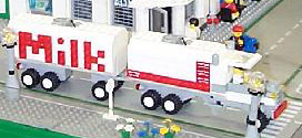
1) Stud-out mosaïc
You can use a ’stud-out’ mosaic technic.
The LEGO® Company proposes a font on the 226 Idea book
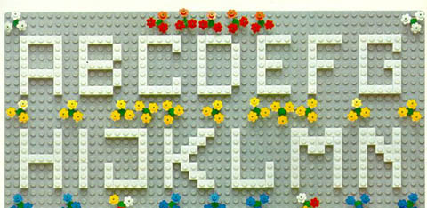
Eric Harshbarger presents a smaller font here based on this technique.
They are easy to use and all the letters and figures can be represented. But this font is not really small : For instance, Eric’s font is 5 studs high and the the bar of letters are 1 stud wide. As a consequence, this technique has not been used too much in LEGO Trains due to the size incompatibility.
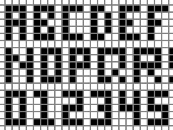
Non-train related examples :
Two of these examples show some 4 stud high letters but it’s not possible to build a complete font in this size.
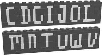
2) Stud-up mosaïc
Stud-up (classical way of stacking plates and bricks) mosaïc letters are smaller. (2 studs tall)
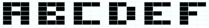
The structure of this font is identical to Eric Harshbarger stud-out font.
The horizontal bar of the letters are 0.4 stud wide instead of 1. The vertical bar of letters is still 1 stud wide. As a consequence, letters may look wider than tall or bolded but that fits quite well with the long side of some engines and wagons. (if you don’t practice length compressionism)
Both stud-out and stud-up fonts particularly fit well with non-rounded and non-diagonal letters such : E,F,H,I,L and T but also with figures and rounded letters which can be squared (A,C,G,J,O,P,S,U).
Some good looking results can be achieved with diagonal letters such N and X.
Stud-up letters are smaller, but it’s not a great advantage because they are shortened only in one direction : that does not allow in practice a better (smoother) dithering. However, this is sufficient to apply into LEGO train MOCs.
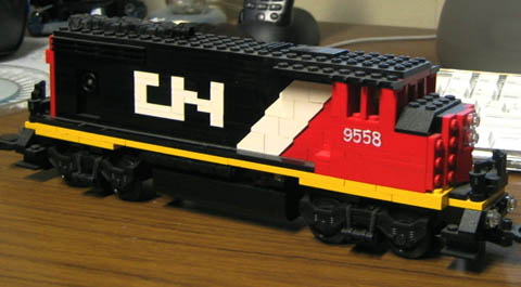
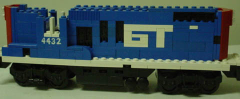
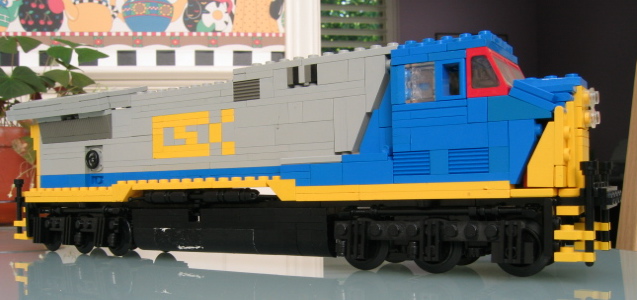
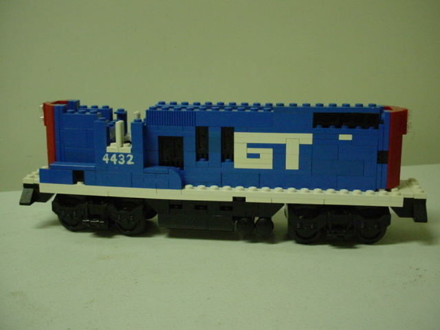
Walt May’s CN, CSX and GT letterings.

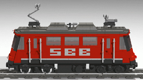
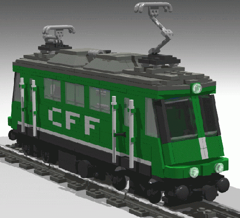
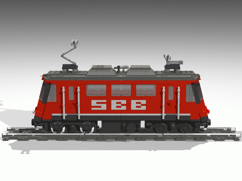
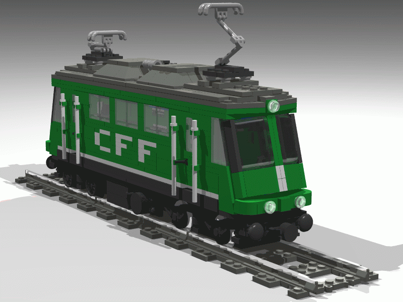
James Mathis’ SBB pattern and CFF pattern on Swiss Re44 engine.
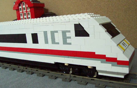
Patrick Rumpel ICE speed train
A lot of Town and Space examples by Masahiro Yanagi

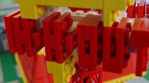
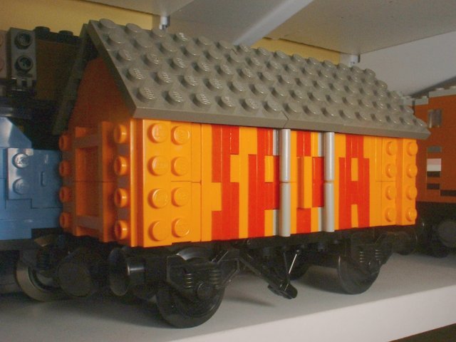
3) Railton’s SNOTized letters.
Jason Railton has written two fundamentals articles [2] [3] on this kind of lettering and uses at least in three creation.
He has defined a font which consists of 90° rotated stud-up mosaïc letters.
Due to the rotation, the horizontal bar of the letters are then 1 stud wide and the vertical ones 0.4 studs wide. The font, which is complete, is 4-studs tall.

Jason Railton’s creations :


Curiously [4], Jason Railton letters are 4-studs high.
It makes representation of letters such E or B difficult (letters with mid-level horizontal lines).
A 5-stud high version of Railton’s letters using stud-out Harshbarger’s letters structure would be better.
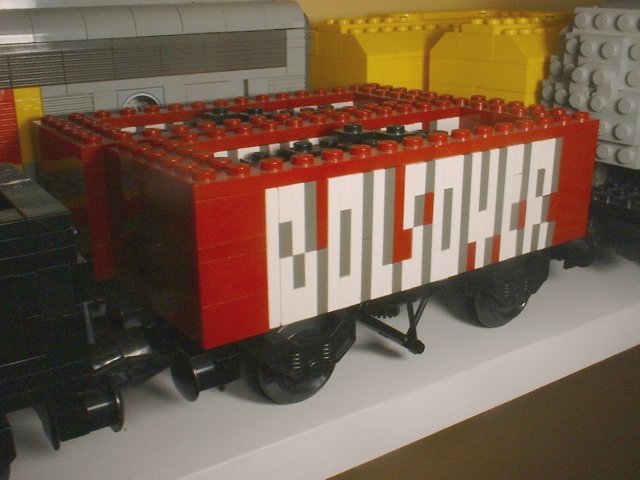
But as the Railton’s letters vertical bar is thin, some good rendering for B and S can be achieved (see Bolsover examples)
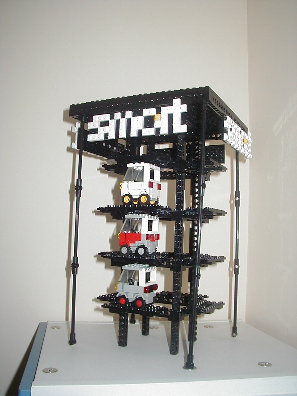
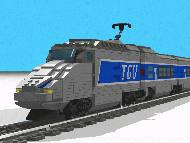
James Mathis’ TGV logo uses a kind of Railton’s lettering which can lead to an incomplete 2.8 stud tall font :
The Italic TGV by James Mathis is a tour de force.

You will find building instruction for his TGV lettering in the ILTCO library article “SNOT Train”.
Mathis’ improvement on Railton’s letters consist of creating up and down 0.4 stud high lines without adding SNOT difficulties.
4) SNOTized fonts
SNOT techniques [5] allows us to create finer letters so we may duplicate letters with more accuracy.
a) Harshbargers’ SNOTized letters
is complete and quite small (3.2 studs) but also quite complicated SNOT mounted. I’ve not been able to find LEGO train examples.
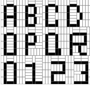
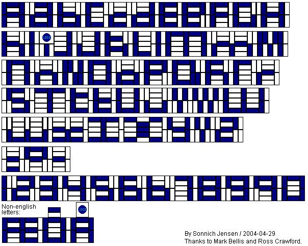
b) Bellis’ SNOTized letters
![]() Jensen/Bellis/Crawford (JBC)
Jensen/Bellis/Crawford (JBC)
is a very small font (2-studs tall) but not complete (B for instance can’t be modeled). The lower case letters model are worth a look.
These letters present both vertical and horizontal 0.4 studs wide lines but are harder to build. SNOT skills are required. The great advantage with SNOT building is that mid-level lines can be easily represented contrary to Mathis improved Railton’s lettering.
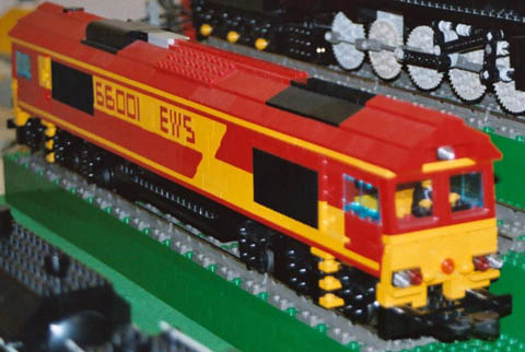
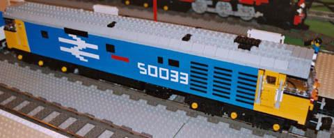
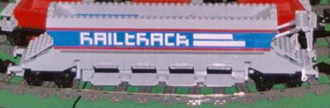
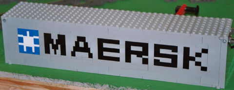
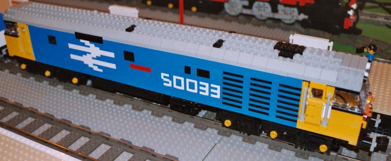
A con to JBC lettering is that the letters are, at least, 2-studs deep. This may prevent you from using such a technique in 6-wide train applications or internal detailed models. At least this technique is well appreciated by builders like Mark Bellis :
Mark Bellis’ 66001 EWS and Glorious Class 50 Hoover 50033
Mark Bellis Railtrack
Mark Bellis Maersk container
5) Font size overview
| Lettering type | Size | Vertical bar size | Horizontal bar size | Font |
|---|---|---|---|---|
| Stud out - TLC | 7 | 1 | 1 | C [6] |
| Stud out - Harshbarger | 5 | 1 | 1 | C |
| Stud up - May | 2.8 | 1 | 0.4 | C |
| Stud up - Mathis | 2 | 1 | 0.4 | C |
| Railton’s - Railton | 4 | 0.4 | 1 | C |
| Railton’s - Mathis | 2.8 | 0.4 | 0.4 | U [7] |
| SNOT - Harshbarger | 3.2 | 0.4 | 0.4 | C |
| SNOT - JBC | 2 | 0.4 | 0.4 | U [8] |
6) Other builders
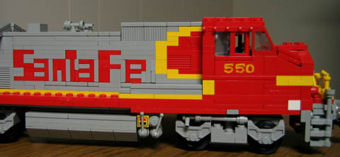
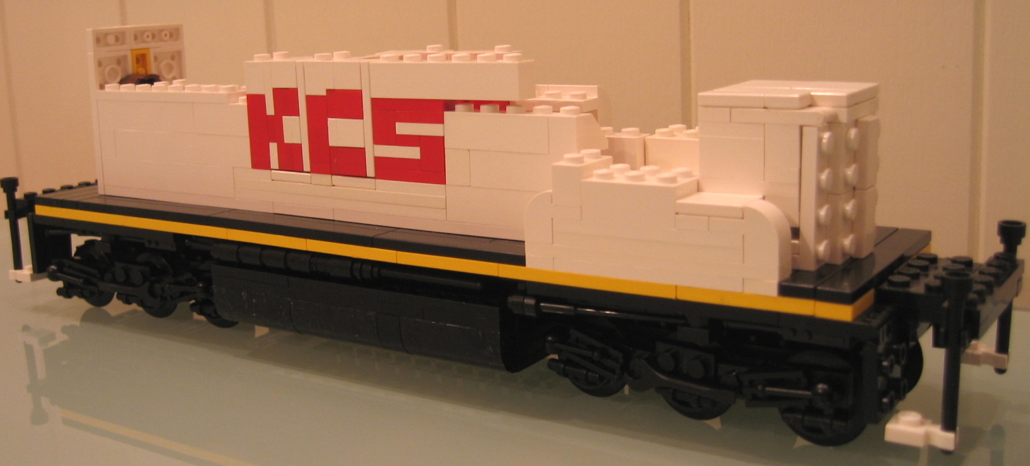
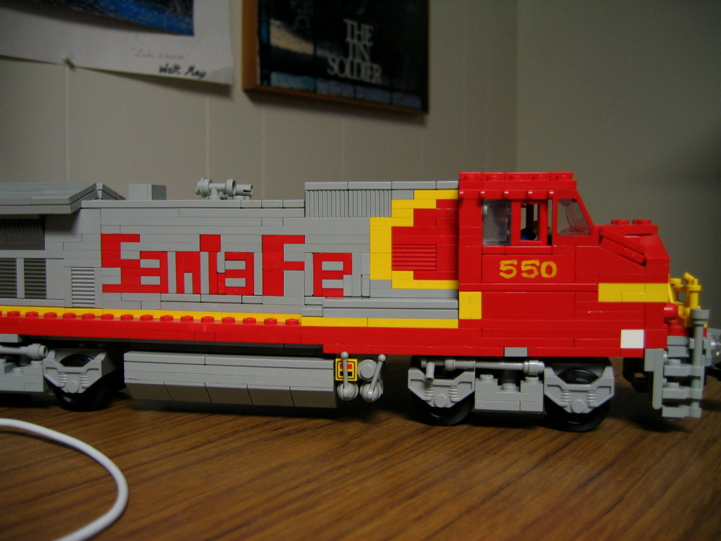
KCS and SantaFeby Walt May. Mixed use of stud-up and SNOT technique.

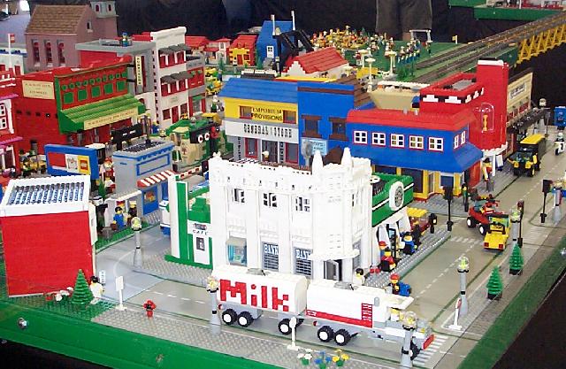
My point of view is train related. Of course, these techniques can be and are applied to other themes such as town (trucks, buildings, etc..) :
In’n’Out Burger sign at the Fullerton Railroad Days by SCLTC
The famous Schleim truck (truck by James Mathis, lettering by Holger Matthes)

(twice the size of JBC letterings)
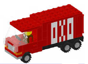
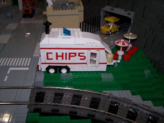
Chips trailer (undetermined author)

7) Other letters
![]() Mosaïc letters
Mosaïc letters
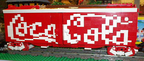
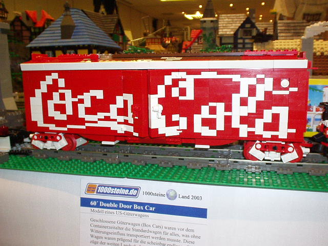
El caracho Coca-cola wagon
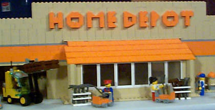
![]() Stud-Up Slope Brick Letters
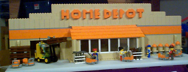
Stud-Up Slope Brick Letters
Steve’s Home Depot
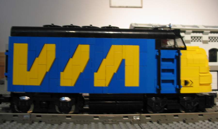
![]() Slope Brick Striping Letters
Slope Brick Striping Letters
VIA engine by Mike Kollross

![]() Round bricks letters
Round bricks letters
Casper Van Nimvegen ESSO sign Letters

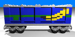
8) Other Non-letter train decorative mosaïcs
off-topic but cool train decorative mosaÏcs

Mark Bellis’ British rail logo
9) Miniland / LEGOland examples
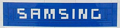
“CLOTHES” (stud-out) and “SAMSING” (JBC lettering) examples
“DAYTONA” (Italicised Railton’s lettering like)

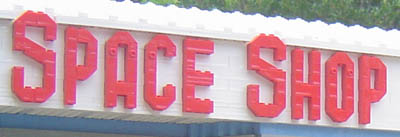
“SPACE SHOP” (Stud-up slope brick letters]
and a lot of great and high resolution examples at LEGO-DESIGNER Miniland shots Brickshelf Gallery.
Conclusion
SNOT Lettering is a typical AFOL technique [9], but it’s not a technique that needs rare parts. Small plates, bricks and tiles [10], Technic 1x1 brick, half pin or 1x1 brick with studs on the sides are all the pieces you need. All of them are available in a wide variety of color.
In reference to Larry who wrote about SNOT [11], lettering ought to be a technique in one’s design arsenal that is used to realise a shape desired.
This study does not tell you which lettering technique is the best.
Some fonts are incomplete but that can’t be an issue which prevents you from using it because you probably won’t need all the alphabet to decorate your train.
Some fonts are smaller or bigger, thinner or wider. On one hand, I like JBC’s letters because they are really thin; on the other hand, stud-up letters, due to their simplicity, should be highlighted. Among all these lettering types, you have to choose the one that best fits your MOC.
Patterned bricks, tiles, and stickers are others answers to the lettering problem but are maybe less creative and less LEGO-pure (home-made stickers). I’ll be happy to read a paper on this subject if you think I am wrong :-).
Acknowledgments
Thanks to :
![]() Erik “Brickerik” Amzallag for sharing his knowledge on building techniques,
Erik “Brickerik” Amzallag for sharing his knowledge on building techniques,
![]() Rob “Brickmodder” Hendrix for his kind help in translation,
Rob “Brickmodder” Hendrix for his kind help in translation,
and special thanks to people quoted in this article.